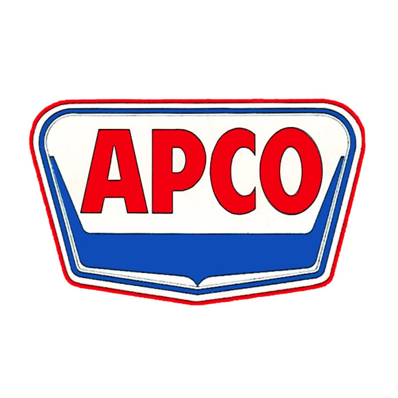
The “APCO” brand name was first used by the APCO Oil Corporation’s predecessor company, Anderson-Prichard Oil Corporation. (Anderson-Prichard Oil Corp. was broken apart and its main components were sold off by its sole remaining cofounder, Lev H. Prichard, Sr., in 1960. While the new investors that bought the main components also bought its trademark names and logos and began using them, the newly-formed APCO Oil Corporation in 1960 was a completely new organization.)
The APCO logo rapidly ascended in recognition after it became formally used by Anderson-Prichard Oil Corporation, and it was used not only on APCO signage but also on all sorts of corporate APCO media, including print ads, oil cans, TV commercials, service pins, maps, and other promotional products.

The Anderson-Prichard & Company (the earliest name for Anderson-Prichard Oil Corporation) likely first used the “APCO” name informally, and internally. The name was derived as a sort of acronymic abbreviation made of the initial letters of its company name: “A. P. & Co.“. The shorter name was much easier to use, and became the name of the company’s headquarters: APCO Tower.
The Anderson-Prichard company apparently first attempted to obtain rights to use the APCO brand name in 1926, when they corresponded with the American Pacific Company, Ltd., of San Francisco, California, who had been using “A-P-CO” on their letterhead. The American Pacific Company offered a limited $500 license of use, but Anderson-Prichard declined.
Anderson-Prichard had a few further sporadic attempts to gain use of the trademark over the years, including facing resistance from the American Oil Company, based on similarity with their trademark for AMOCO. Eventually, an agreement was achieved with the American Oil Company in 1954, formally allowing Anderson-Prichard Oil Corporation to use the APCO name under certain geographic and style limitations.

The trapezoidal APCO logo was a great example of a transitional style between the classic motifs of old U.S. logos, which often relied upon use of very literal symbols and traditional shapes, and more the modernistic, abstracted shapes that began to be introduced in the 1950s through 1960s. Classic shop signs often used slight visual references to heraldry, which was originally displayed on shields. The shield or badge shape has often been used in shop signs and road signs. The new APCO logo very lightly referred to this classic shield shape, although it was shaped with stronger, more exaggerated angles, and was streamlined with rounded corners. The shape, coupled with the bold, sans-serif, all-caps block letters of the name, combined to make a unique logo.
So it was that Anderson-Prichard Oil Corporation began increasingly operating under the APCO service mark. The company displayed both brandnames for some time, on things such as road maps, and advertisements. A few years later, when primary parts of the company were sold off to a group of investors, the newly emerging company opted to complete the conversion to using “APCO” as its central brand name, and “Anderson-Prichard Oil” was used no longer.

Late in the life of the APCO company, near the end of the 1970s, the logo was redesigned to modernize it further, dropping the trapezoidal shield shape, and switching the letters to an uppercase “A” with lowercase “pco”, set in an san-serif typeface that was italicized, conveying the concept of speediness.

We have only seen a very few examples of this last “Apco” logo form, so we are supposing it was introduced just as the company was stumbling into its final stage before it was liquidated.
If you have additional examples of this last “Apco” logo, we would love to see them!


